Summary
- End-to-end design of a transformative data and reporting product tracking participant data and grant outcomes for YouthBuild USA's 180 programs nationwide
- Coached internal product team in successful transition to modern Lean UX, agile, and user-centered product development practices
- Led follow-up qualitative research to assess impact and inform roadmap strategy
Goal
The goal is best summed up by the product vision statement we developed as a team at the outset of the project:
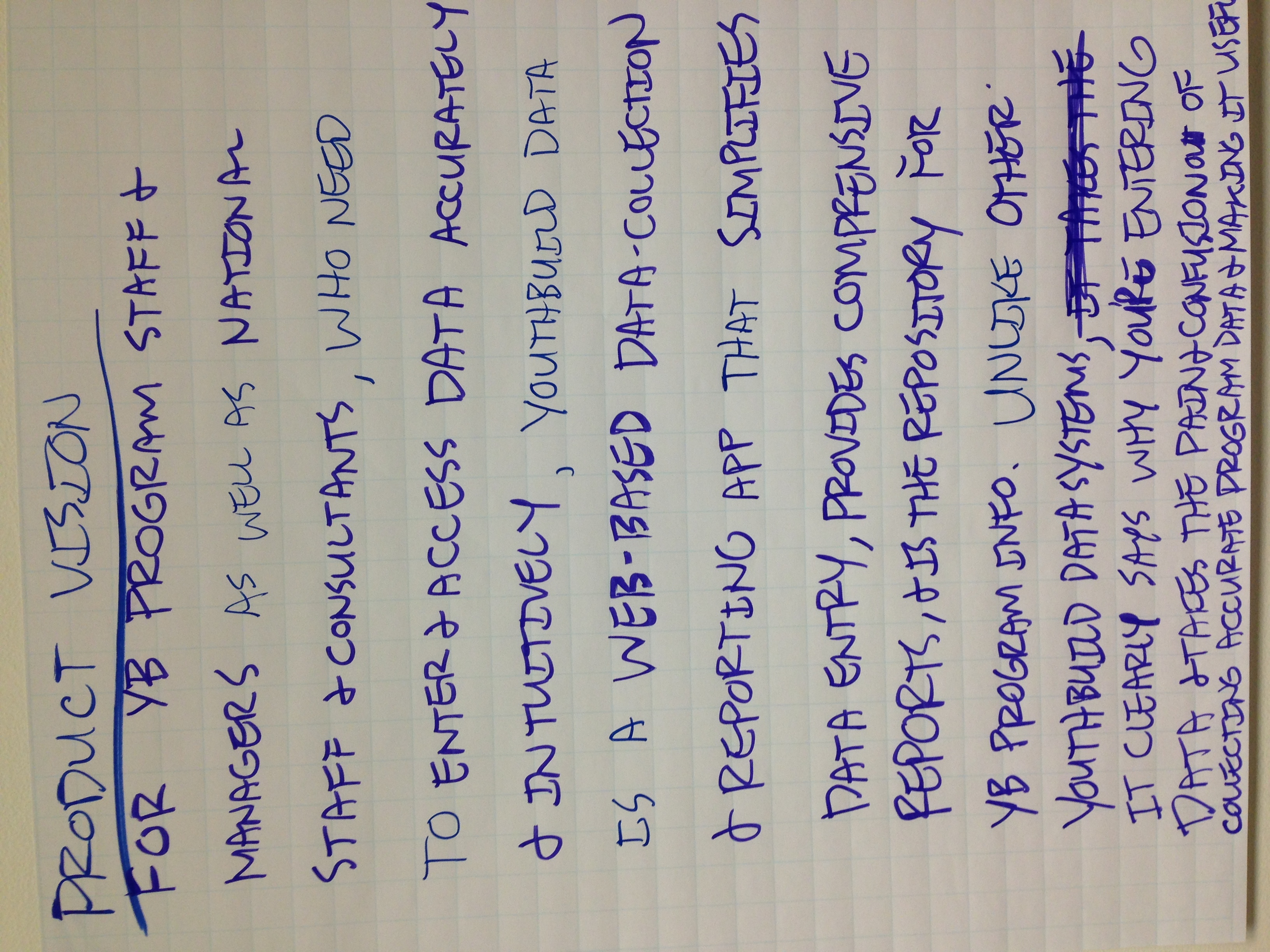
For YouthBuild program staff, managers, and consultants, who need to enter and access data accurately and intuitively, YouthBuild data is a web-based data collection and reporting app that simplifies data entry, provides comprehensive reports, and is the repository for YouthBuild program info. Unlike other YouthBuild data systems, it clearly says why you’re entering data, and takes the pain and confusion out of collecting accurate program data and making it useful.
Background & problem
YouthBuild USA is a youth job training nonprofit, with over 180 programs nationwide.
Program and participant data collection was a cumbersome, error-prone, linear process that made reporting so difficult for program staff that they only entered data when it was absolutely necessary, on a quarterly basis. This was stressful for program staff as well as support staff at YouthBuild national who would deal with an onslaught of support requests on a quarterly basis.
Furthermore, the reporting was one-way, offering very little value to program staff in terms of data that might help uncover insights or drive program decisions. This resulted in longer feedback loops and made it more difficult for programs to improve as well as receive the support they needed to achieve their program goals.
Finally, the existing process for developing and improving the custom reporting software was not iterative, resulting in painful “big bang” releases that involved lots of up front planning before release, and chasing down bugs and retraining program staff after release.
Approach
I engaged with YouthBuild USA over the course of a couple years, with an initial, intensive, prototyping phase lasting around half a year.
Kick-off design sprint
To start, I facilitated a week-long design sprint with the staff product team, where we developed the following:
- Product Vision statement
- Overall measures of success
- Theory of change
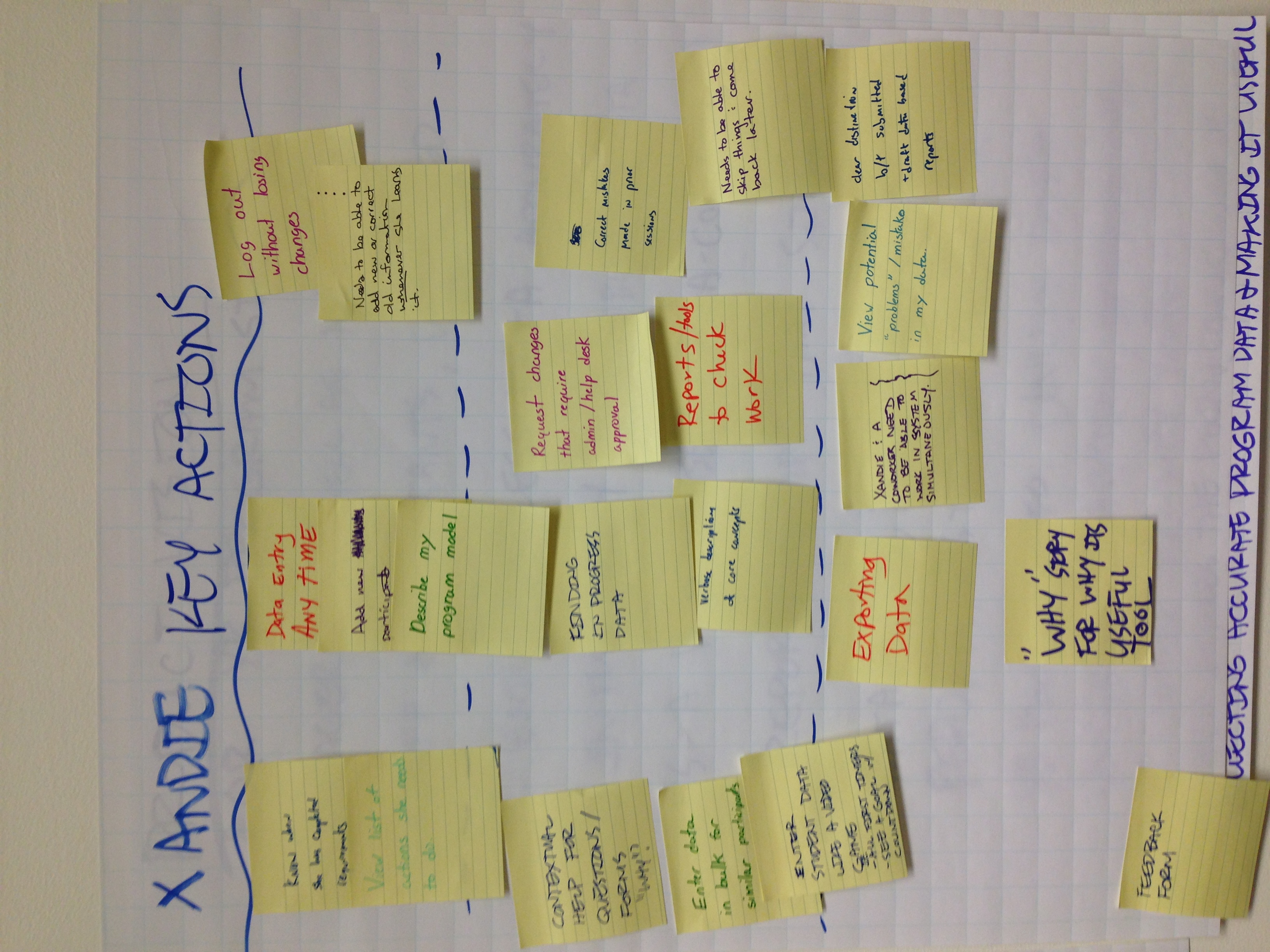
- Personas along with key actions and measures of success
- Initial sketches of key actions
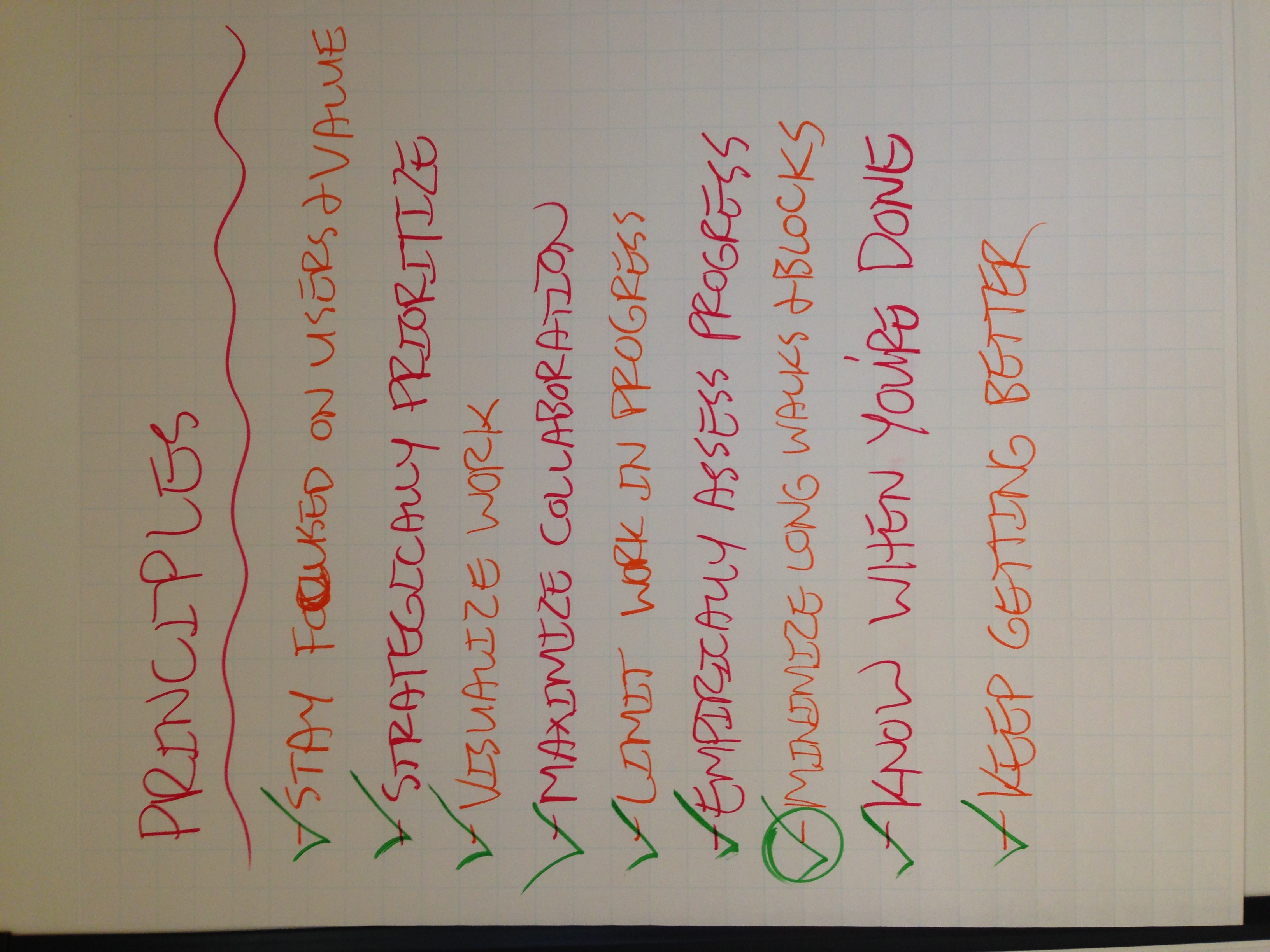
- Agile process agreements, progress measures, and definition of done
- Team principles
- Onsite schedule and working hours
Lean UX development of prototype
Working cross-functionally with an engineer, program manager, and director of data, I coached them through lean UX and agile software development practices.
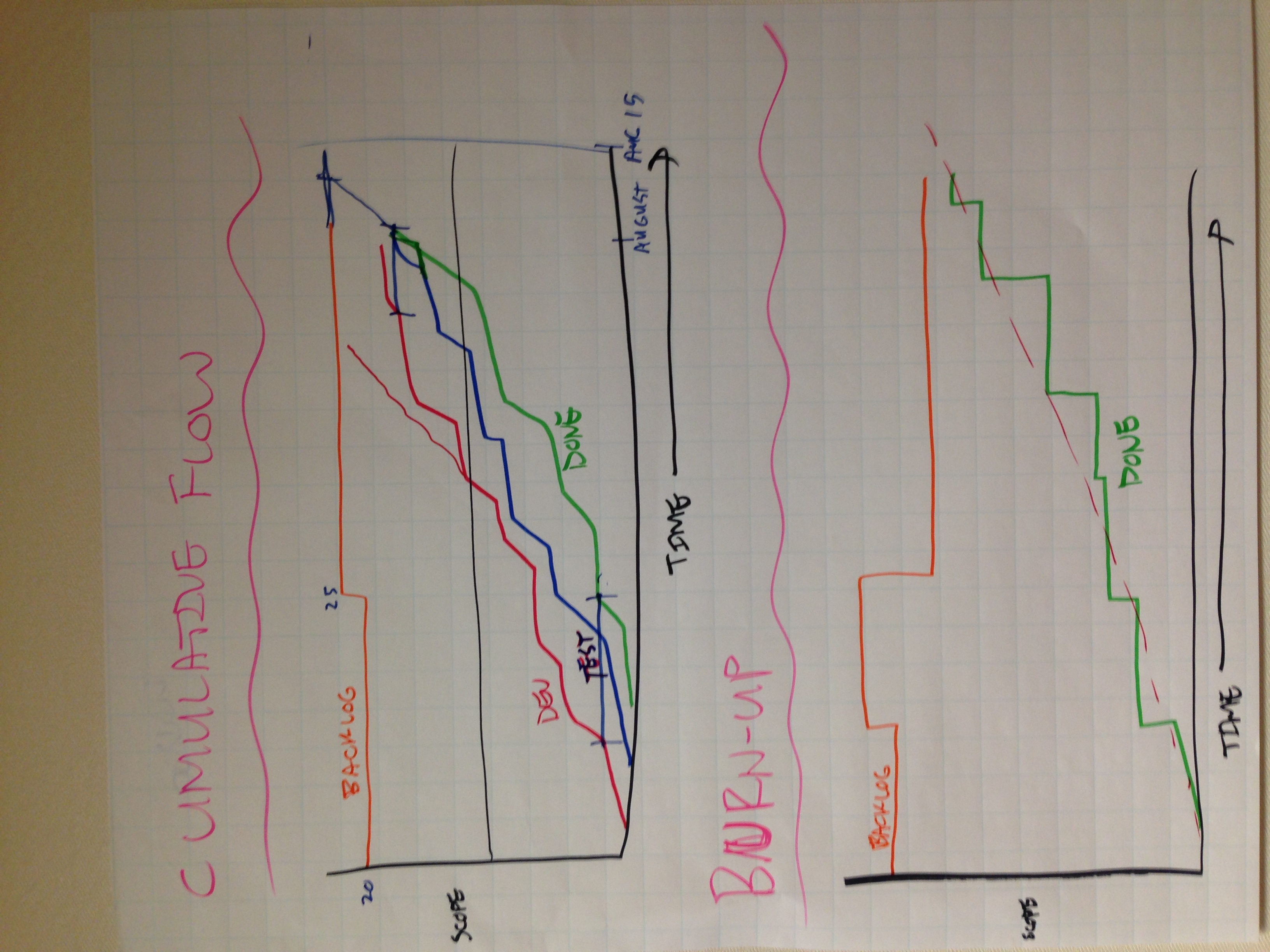
After the kick off, we filled a wall in an office with stickies of known needs and capabilities in the form of user stories. I introduced the idea of a minimum viable product (MVP) and we created a dividing line on the wall and sorted all critical stories above it. We then tracked our progress using a cumulative flow diagram and continually improved our processes through regular retrospectives.
We validated the assumptions represented by our rough personas using discovery interviews with both program and national staff, ethnographic/ride-along experiences with users of the existing and prototype software, and iterative testing with a pilot cohort of users to shorten feedback loops and practice user-centered design.
Release and improvement
About a month after release, well before the next quarterly reporting deadline, I conducted research interviews with over a dozen staff at the program level. These interviews were to assess how the new YouthBuild Data was fitting into their day-to-day programmatic work, and to identify any remaining pain points, giving the product team clearer direction for their roadmap over the following several months.
We also involved the help desk staff as members of the product team throughout the development of the product as well as after release. This ensured a short feedback loop and that problems were surfaced quickly.
Solution
There were several key innovations that emerged out of the human-centered, lean UX design process I coached the team through. They were:
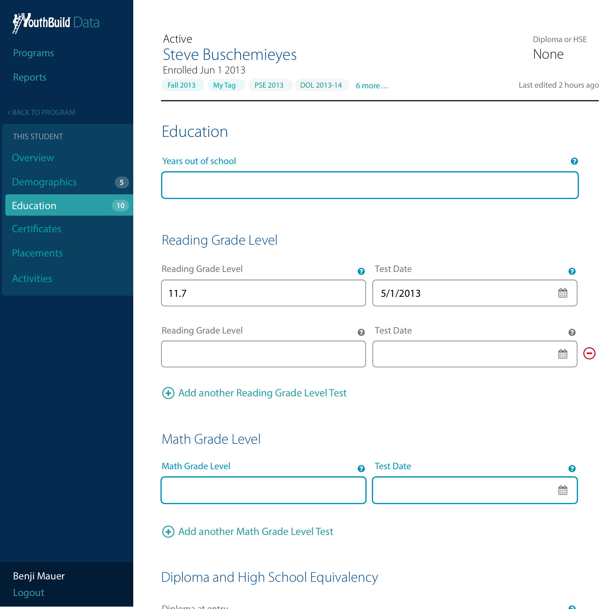
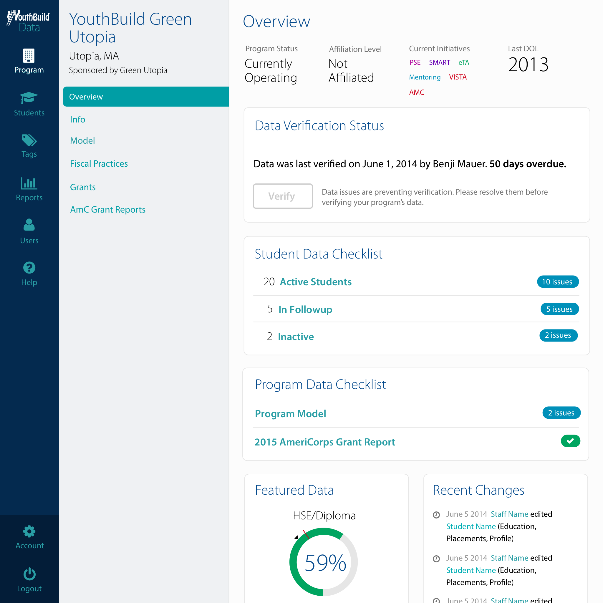
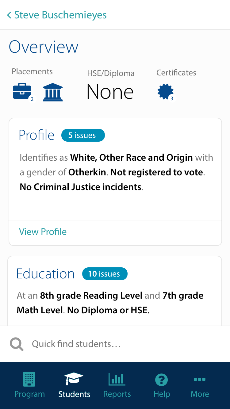
- Clear feedback on the state of a given record and data point, gently directing the next action. This was combined with an open-access, realtime data system that allowed program staff to easily enter data as it came in
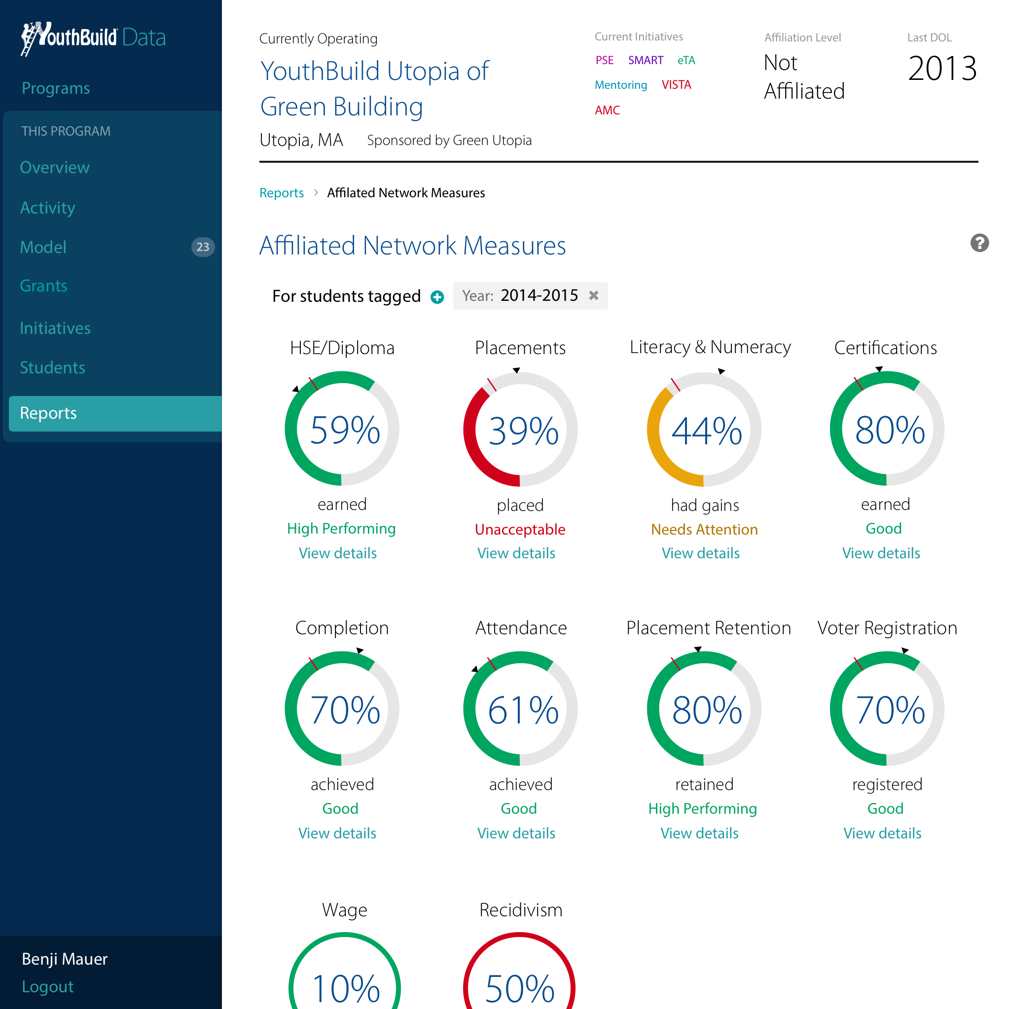
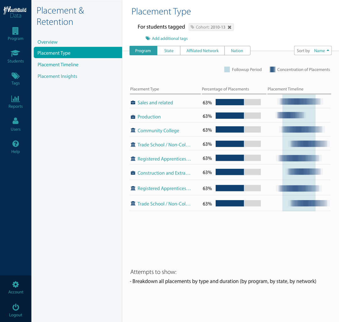
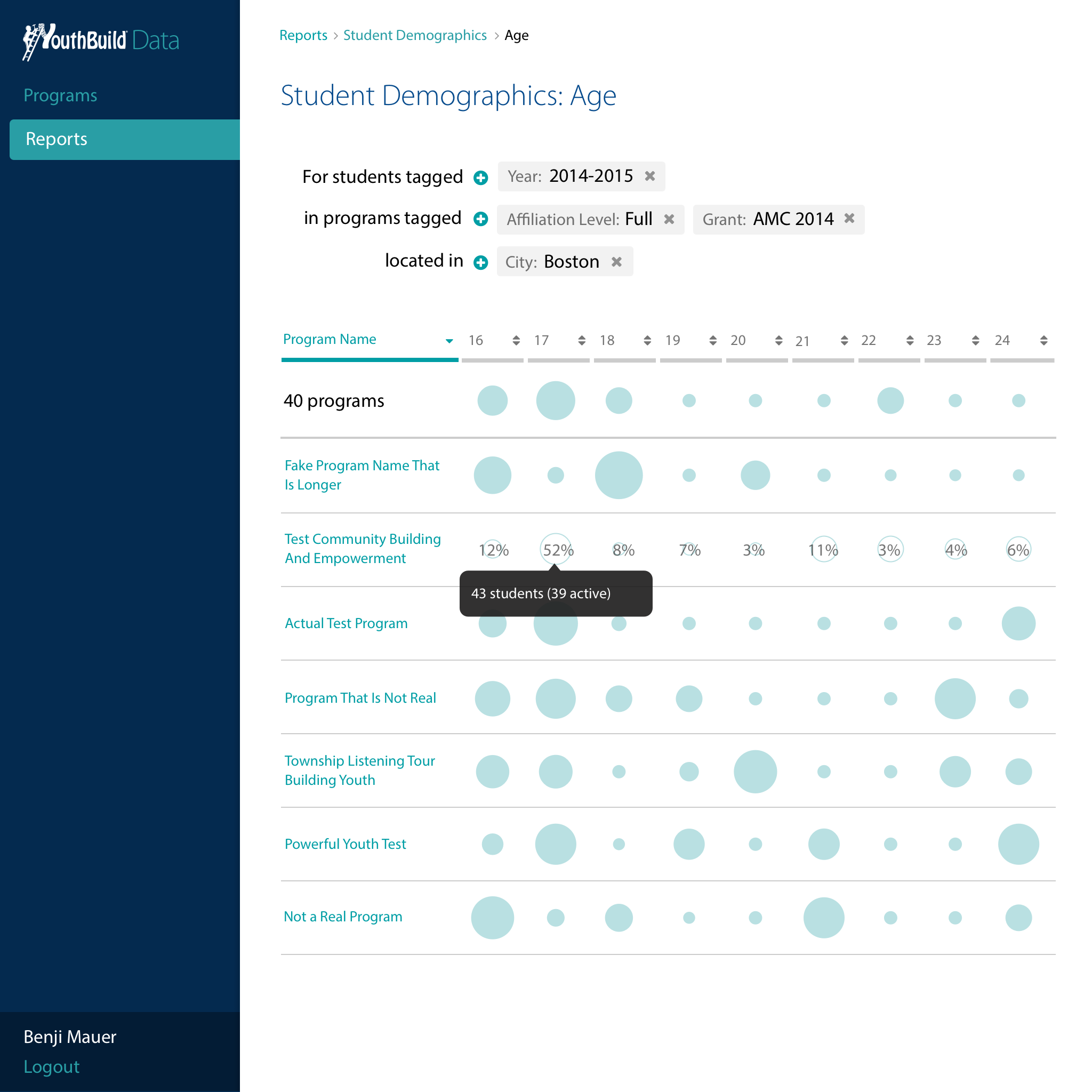
- Powerful reports that allowed funders and staff from the local level all the way to the national level have a conversation about program and grant outcomes, compare similar cohorts while respecting privacy, and identify opportunities for improvement
- Shared data definitions for commonly required data
- Flexible information architecture requiring just a few clicks between national outcomes and individual participant data
Clear feedback, directing next actions, and realtime data
Powerful reports
Flexible information architecture
Outcomes & reflections
While I’m not at liberty to share specific numbers for outcomes, the product was a resounding success:
- Dramatically reduced help desk requests. This allowed help desk staff to focus more on training and capacity building.
- Post-launch interviews validated that it improved the day-to-day experience of program staff who were entering the data. This made it feasible for programs to move away from cumbersome and error-prone paper files as an intermediate step that they’d then have to enter in bulk at the end of each quarter.
- Much more accurate and timely outcome data for funders and national staff. This enabled new, more proactive approaches to program management that led to better outcomes.